The Otus Design System
Problem
After over three years of product development of Otus, we were left with a comprehensive tool to help educators and students excel in the classroom. But in doing so, we had allowed inconsistencies to become common in our application. With four types of user accounts, four development teams, and one design team, we struggled to define a consistent design language for our entire platform. With the recent addition of a dedicated front-end team, we had the ability to begin auditing, redesigning, and implementing a well-rounded design system.
Solution
Create a process
Developing a process to create components, critique them, and deliver to our front-end team was extremely important. We worked closely with our developers to make this happen.
Follow Atomic Design principles
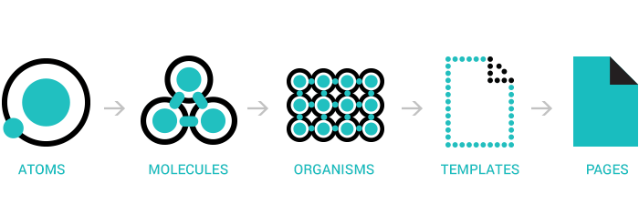
Building components beginning at the smallest atom to sophisticated organisms will allow us to be flexible, yet organized, simplified, and uniform.
Audit & Classify
We needed to bring all product and UX designers together to begin auditing the app for individual components.
Utilize common styles and components with Figma
When components are done being audited, we create new components in a Figma Library, utilizing Autolayout for master components.
Create a Process
Creating and installing a design system is a vigorous task. We needed to plan and organize with our development teams to make sure all of us were on the same page in terms of planning and implementation of new components. Our front-end team began using Storybook to house all components. We created a process to push new or updated components into our design system library in Figma, then to Storybook.
Follow Atomic Design Principles.
In order to be successful in building out our design system, it was incredibly important to build out our components following Brad Frost’s guidelines on Atomic Design. By using these guidelines, we can assist both our design and development team build an extensive system of components and styles that we can reuse and recycle to create new components down the road.
Audit & Classify
Our team first established a plan to audit the app for all components, starting with buttons. In the example, below, we can see instances of inconsistency. Each individual button’s location was recorded, in addition to detailed notes about any states, they may or may not have.
Our team audited over 600 individual buttons. My role during the audit was to review each button individually and assign it what I believed to be a viable replacement button component. In addition, accessibility standards were referenced to make sure that any new button used moving forward would be keyboard accessible, readable on a screen reader, and pass all color contrast tests.
Utilize Styles and Components Using Figma
Following the results of the audit, I led the creation and development of an official organization-wide design library in Figma. When each new component had been audited, reviewed, and redesigned, it was published into our Figma component library. Using Figma’s tools like auto-ayout, I was able to create comprehensive master components and organize them for the use of our entire design team. From there, I collaborated with our front-end developers to build each component in Storybook. Over the course of several months, new components continued to be audited, redesigned, and replaced in all of Otus. This effort continues today, and our component library has grown to over 40 individual components used in all Otus products.
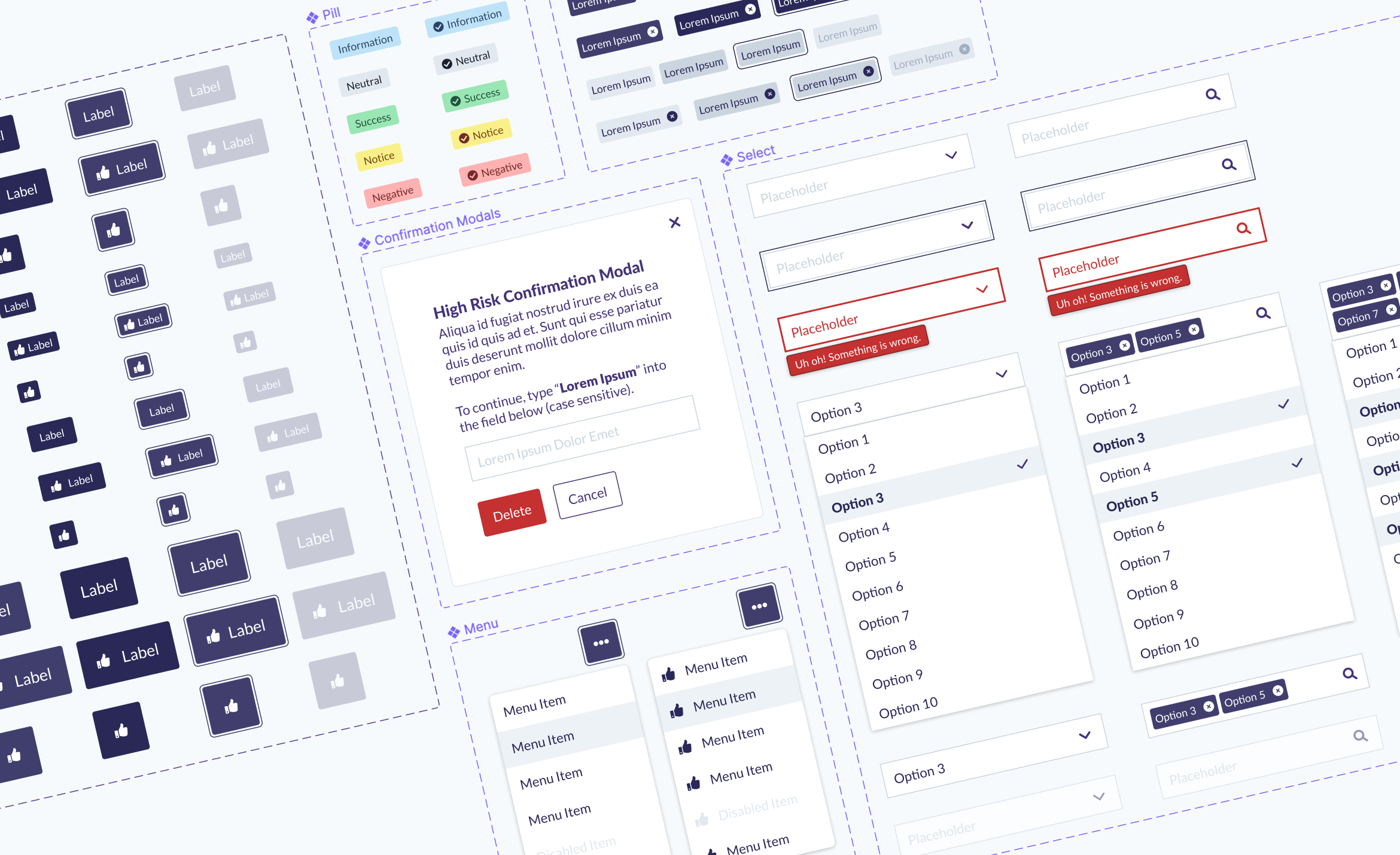
Select menu master components. Using autolayout, each component can be customized based on text, state, and size.
The final result of the button audit. Each designer can quickly find and use each individual button by specifying the button’s color, state, icon, and size.


