Navigation & Classes
Objective
Otus’ student users need to use a dated and inefficient navigation menu in order to engage with Otus on a daily basis. In addition, the information architecture of their user type requires students to hop from one module to the next in order to find content related to the class they may be in.
The objective was to both streamline and rethink our information architecture for student personas, while also using this opportunity to make the navigation bar more efficient, accessible, and polished.
Research & User Pain Points
“Students frequently have a hard time finding the right assessment I’ve assigned to them.”
“Every time a student goes to the Assessments or Lessons modules, they need to specify what class they are in in order to view all content specific to my class.”
“With our Chromebooks, students aren’t able to view all the modules available in the navigation menu without scrolling down.”
In my time at Otus, I have frequently heard from teachers and educators that they enjoy having all of their created content in one place. For example, a teacher that creates an assessment for all 4 of their US History classes can go to the Assessments module, click on the assessment name in a table, and view all students that have taken that assessment (even if they are in separate classes). While this is incredibly advantageous for educators, for students it’s a much different experience.
For every user type, Otus provides a different navigation UI structure based on their persona. Admins and teachers are the most similar as both personas are focused on the creation and management of educational content. Students, however, don’t manage content in nearly the same way. Each class is a separate entity with its own series of assignments and syllabi. While organizing our application based on the content or tools we provide make the most sense for our educators, our students are left with a lot to desire in their UX.
Analysis
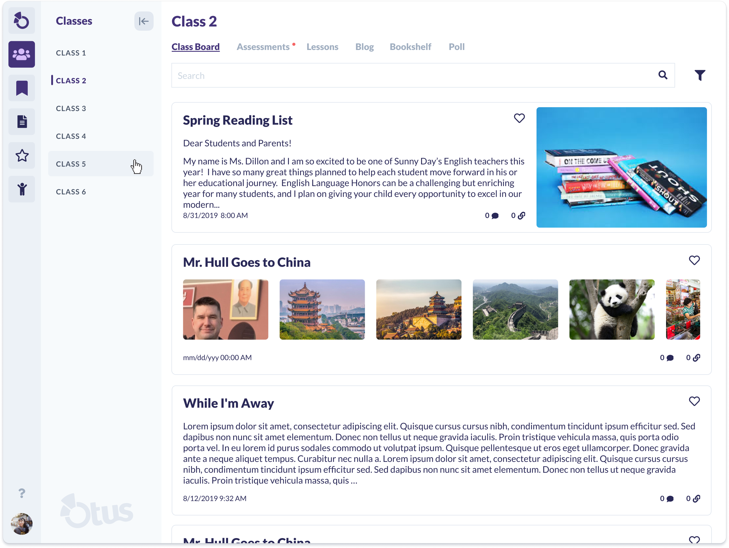
My first step was to visualize the information architecture of our student accounts. By separating all modules that have content siloed per class, I was able to reduce the needlessly large amount of modules in the student navigation bar. Now when students log in to Otus, they will have the ability to immediately select the class they want and immediately view all related content to that selected class.
With a new information architecture sketched out, I now had to think about what changes to the UI of the navigation menu would need to occur for this new organization to make sense. Additional care needed to be taken here as well in terms of additional front-end work that might be required. The ideal solution would be to repurpose the navigation bar, expand on class selection, and add a new means of selecting a module (assessments, lessons, blog, etc) without impacting the existing UI of those modules.
Ideation & Design
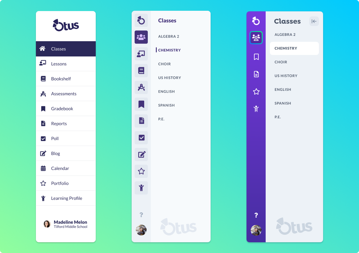
With the information architecture sketched out, I began experimenting with how it would look in a similar navigation menu to the current one. The current navigation menu, however, was also in need of a design update. Work on our design system had progressed rapidly, and certain elements of our navigation menu felt dated and out of place.
To address improving the UI, I decided to utilize the use of our new selection of gray colors to soften the contrast from the previous version. Reworking the colors and utilizing existing components got me to a good stopping point to review what I had made. I made note of modules in red below that needed to be removed and placed inside class pages, also noting that removing these from the main navigation will also remove icons that can be extremely difficult to understand.
I took these sketches and brought them to a feedback session with members of our design and front-end teams. Feedback indicated that this version of the navigation menus felt too gray, and it was proposed that the user should be able to minimize the secondary nav that opens when in the Classes module.
Using this feedback, I went back to the drawing board. I first wanted to experiment with different ways we could minimize the menu without being too intrusive on the UI. I went to Dribble and other applications like Intercom and Jira for some inspiration. After experimenting with a few options, I had a couple of ideas that interested me:
Both of these options felt like they were on the right path, but still not quite complete. I preferred the option with the arrow in the purple circle but recognized the button would get in the way of a minimized menu. The other option I preferred even less due to obvious issues we would encounter with the minimize button getting in the way of existing UI outside of the menu. The minimize button can also use a more intuitive icon to signify exactly what it does. With this, I found a solution I thought to be the most ideal:
I expanded on what I liked about the purple circle idea, utilizing margins that exist globally in Otus. This way, when the menu is minimized, it takes up empty header space I know we already have and does not overlap any module button in the primary navigation menu. Only two issues remained: addressing the gray appearance and determining where to house the links for each class-specific module (assessments, lessons, etc). In thinking about utilizing the header space, I believed this would be an ideal opportunity to bring in some navigation at the top of the screen.
Almost there! My final task would address the navigation menu (and the rest of the page) from appearing too bright. The white background made it difficult to see component borders on the page and using only gray for the navigation menu made its depth difficult to discern. Plus, I wanted to make this updated navigation more exciting. I addressed this by altering our background color to light gray to help components pop off the screen, and used a colorful purple gradient to enhance the feel of the primary navigation menu. In addition, I utilized “Isadora”; another font we introduced to our design system which works perfectly as a header style. My final alteration involved updating all navigation icons to thinner, more modern versions of their previous design. The final result is a product I am proud to present.
Testing Plan
Before work begins on this project, we need to prove my hypothesis that this reorganized navigation menu will serve our students effectively. We plan to utilize tree testing to support our changes to the IA, A/B testing to confirm the preferred method of minimizing the menu, and test icon recognition for primary modules in the menu as well.
The results from these three testing methods will give us enough data to confirm my assumptions, and assist us in translating this new menu and IA to other personas.


